Mobility & fitness2026EN
MOTION
Five screens on a single 390 × 844 canvas — where the first second answers “how is today going”, and fifty sessions sit one tap underneath.
- Mobile app
- Product UI
- Charts
- Design system
- Industry
- Mobility & fitness
- Engagement
- 6 weeks
- Team
- 1 designer · 1 engineer
- Platforms
- Mobile application · Route explorer · Goal tracking · Device-frame web demo
01
Challenge
Activity apps fail in one of two directions. Either the number you opened the app for is buried under a dashboard, or it is the only thing there and you cannot do anything with it. MOTION had to answer “how is today going” in the first second and still hold fifty sessions, thirty places and nine goals behind that answer.
It is also a phone app that lives in a browser. Everything is drawn on one 390 × 844 canvas with no desktop layout to escape into, so every list, sheet and chart has to work at the width of a hand — including the places where a wider column would usually solve the problem.
- Canvas
- 390 × 844, no desktop rewrite
- Content
- 50 sessions · 30 places · 9 goals
- Core difficulty
- One glance first, depth underneath
02
Solution
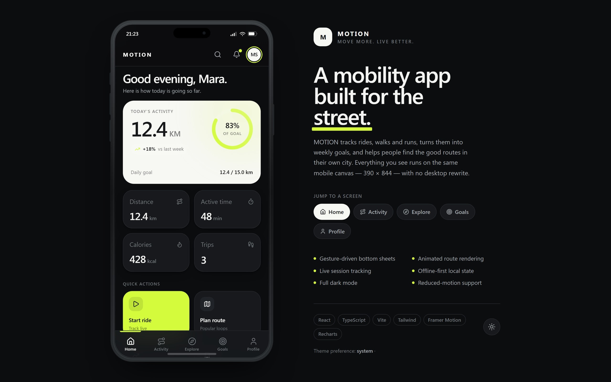
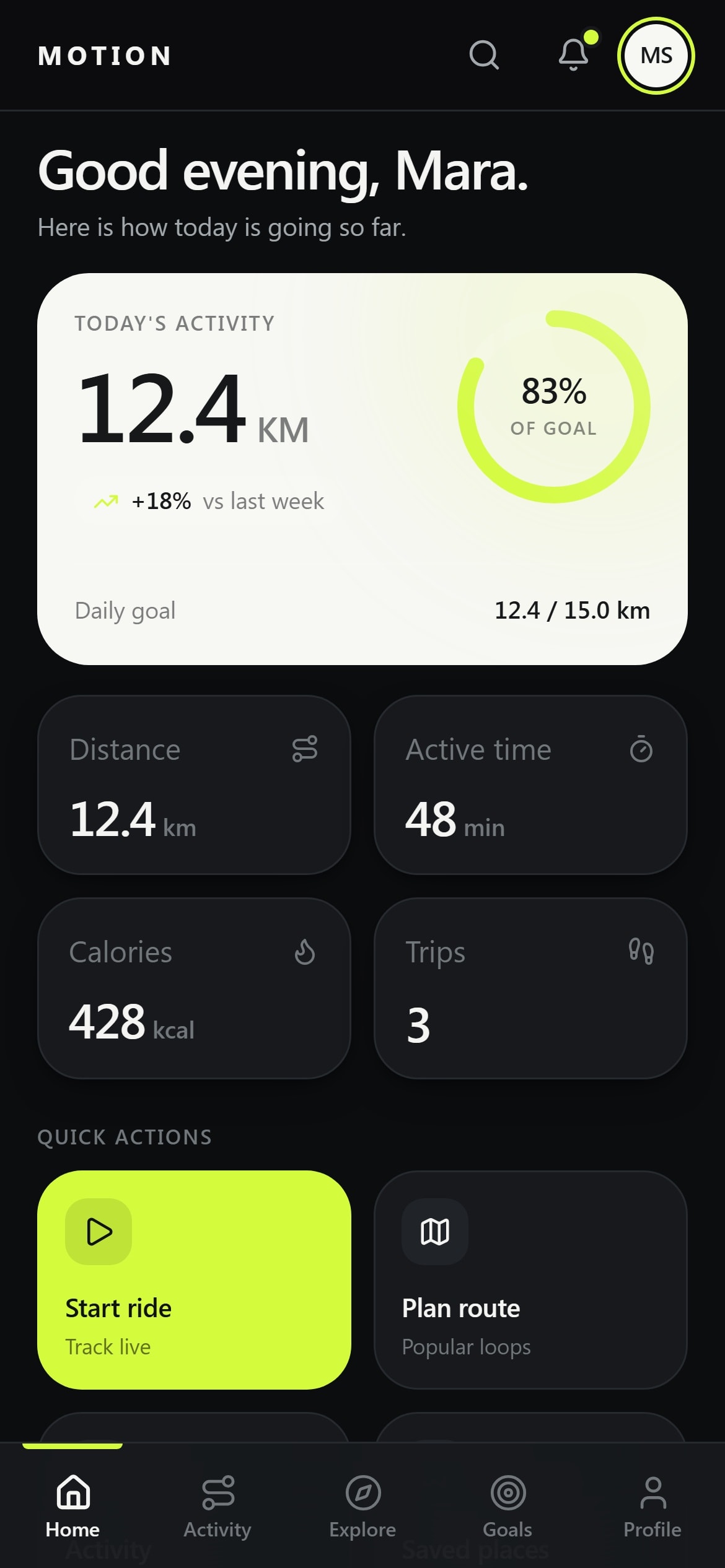
The home screen answers and then stops: today's distance, the share of the daily goal it covers, and the change against last week. The four tiles, the week chart and the last three sessions are all deliberately read second.
Depth is one tap away across the other four screens, and detail opens as a bottom sheet rather than a new page — so opening a route or a session never costs you your position in the list you were reading.
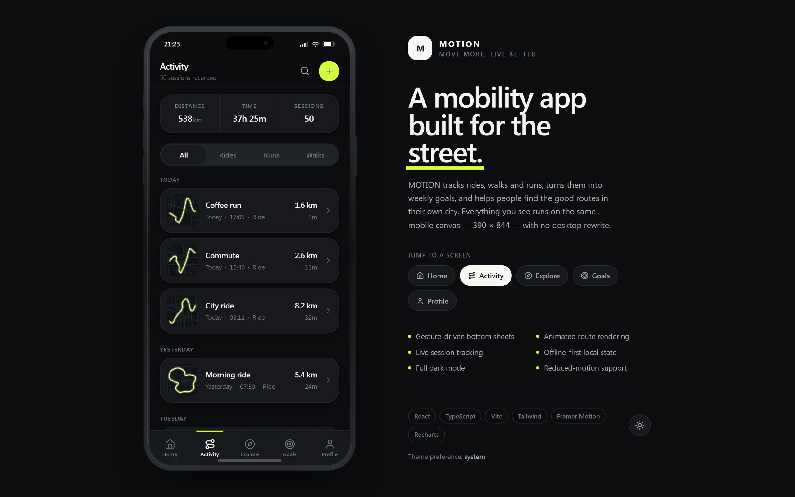
Every figure comes from one local store. The week total on the home chart, the 538 km on Activity and the progress on a weekly goal are the same sessions counted once, which is what stops the app disagreeing with itself while it is offline.
- Home
- One number, then the rest
- Depth
- Bottom sheets, not new pages
- Figures
- One store, counted once
03
Architecture
- L0Vite + React shell390 × 844
- L1Five screensHome → ProfileBottom sheetsGesture-driven
- L2App stateOne store
- L3Derived totalsWeeks, streaks, goals
- L4Session log50 sessionsPlaces & routes30 entriesGoal model9 active
- L5Device storageOffline-firstSystem preferencesTheme · reduced motion
Connections (11)
- Vite + React shell → Five screens
- Vite + React shell → Bottom sheets
- Five screens → App state
- Bottom sheets → App state
- App state → Derived totals
- Derived totals → Session log
- Derived totals → Goal model
- App state → Places & routes
- Session log → Device storage · persist
- Goal model → Device storage
- Vite + React shell → System preferences · theme & motion
04
UX
Navigation is a five-item bar within thumb reach, and the app opens on the screen people actually come back for. Filters on Activity, Explore and Goals are chips rather than menus, because a menu costs two taps to reveal what a chip states outright.
The weekly chart is not only a picture. Every bar carries its own sentence — “Thursday: 12.4 kilometres over 3 trips” — so the same information exists for a screen reader and for anyone who cannot judge a bar height at a glance.
- Reach
- Five-item bar at thumb height
- Filtering
- Chips, not menus
- Charts
- Every bar readable as a sentence
05
UI
Near-monochrome with a single acid-lime accent that marks progress and the primary action and nothing else — the goal ring, the active tab, the Start ride button. When the accent means “this is your progress”, it cannot also mean decoration.
Numbers are the typography: distance is set large with its unit small beside it, so 12.4 KM reads as one measurement rather than a number and a word. Light and dark are designed as a pair, not one inverted into the other.
06
Development
State is local-first. Sessions, saved places and goal progress live in one store that persists to the device, so the app opens with your data already in it rather than waiting for a network to answer.
Charts are Recharts driven by the app's own tokens instead of the library's defaults, and route lines are drawn with Framer Motion — a route card animates its own path rather than loading a map tile.
Every animation has a still state. Under prefers-reduced-motion the sheets, the progress ring and the drawn routes resolve instantly to their end position instead of being switched off into blankness.
07
What it does
Today's activity
Distance against the daily goal with a progress ring and the change on last week.
Weekly chart
Seven days of distance and trips, each bar also written out as a sentence.
Session history
Fifty sessions grouped by day and filterable by ride, run or walk, with distance and duration on every row.
Explore
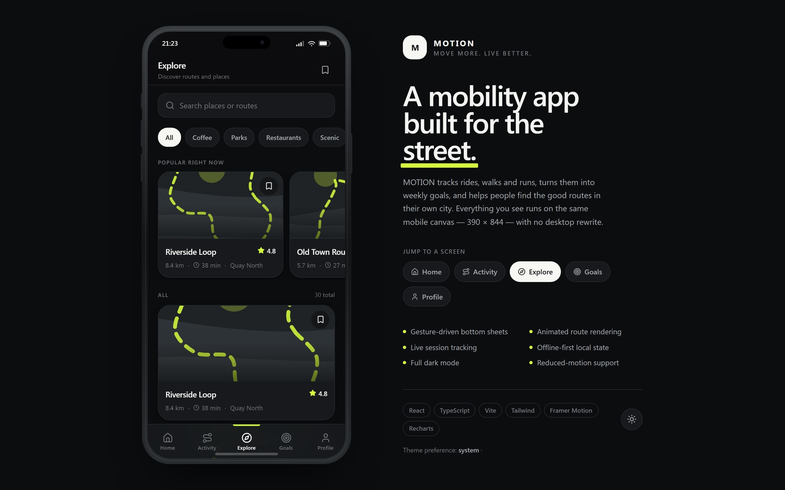
Thirty routes and places filtered by coffee, parks, restaurants and scenic, each with rating, distance, duration and district.
Animated routes
Route cards draw their own line instead of fetching a map tile.
Goals
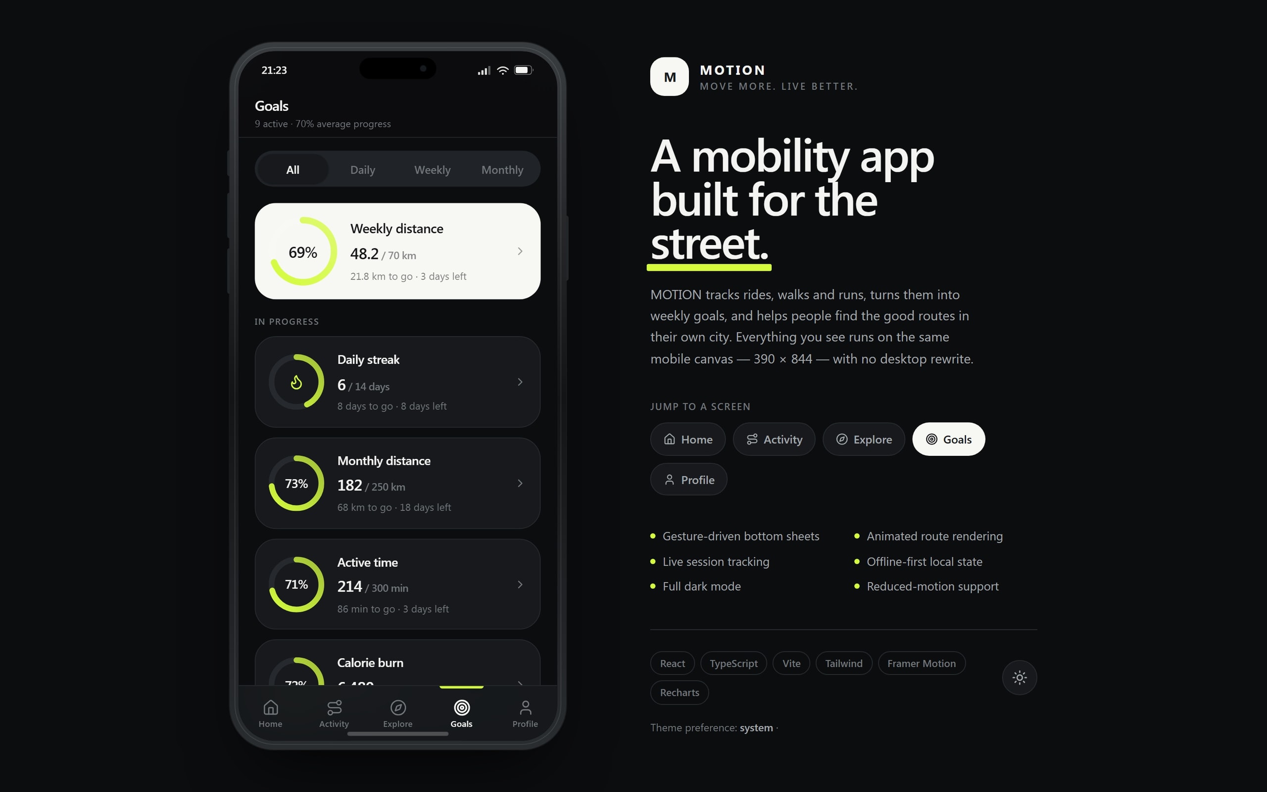
Nine active goals across daily, weekly and monthly horizons, each with what is left and how long there is to do it.
Bottom sheets
Detail opens as a draggable sheet, so you never lose your place in the list behind it.
Profile
Streak, month and all-time totals, units, theme, notifications and a local data reset.
08
Integrations & stack
Integrations
- Device storage
- System theme
- Reduced-motion preference
Frontend
- React
- TypeScript
- Vite
- Tailwind CSS
Motion & charts
- Framer Motion
- Recharts
State
- Local-first store
- Persisted session log
09
Where it landed
- 5
- Screens
- 390 × 844
- Canvas
- Local-first
- State
- Fully reducible
- Motion
Home · Activity · Explore · Goals · Profile
No desktop rewrite
Opens with your data, network or not
Every animation has a still state
A phone app that behaves like one inside a browser tab: it opens on the number you came for, and everything else is one tap and one store away.
Every build is designed for the phone as its own experience, not as a narrowed desktop layout.
Got a product that should exist by now?Tell us about it.
Describe what has to change in your business. We will work out what that actually takes — including when it takes less than you think.